Five simple steps to designing grid systems - Part 2
In part one of this Simple Steps series I talked about how to use a simple ratio, that of the paper size you are using, to create a symmetrical grid on which to create your designs. This, the second part in the series, will deal with other ratios and how they can be combined to create more complex grid systems.
Relating to grid systems
I’ve talked a few times about using the Golden, or ‘Divine’, Section in the grid systems you design. So, before you continue I suggest you read the background in this article and my article in Design in Flight. For those who don’t want fork out your hard earned cash on the DiF article, I’ll summarise:
The Golden Section is a ratio which is evident throughout the universe as the number Phi. You can use this ratio to good effect in design by making sure that elements of your grid conform to this ratio. Using the Golden Section can ensure a natural sense of correct composition, even though it is based in mathematics it will ‘feel’ right.
This is an important point and has been argued and debated for ages. Aesthetics can be measured and more importantly can be constructed. If you want something to be aesthetically pleasing there are steps you can take to make sure it is going in the right direction. Now I’m not saying that ‘follow these rules and you will create something beautiful’. What I am saying is that by following a few of these guidelines can go some way into creating something compositionally balanced, which will inherently be more aesthetically pleasing.
Composition can make things more usable
This is a theory that exists called the ‘Aesthetic Usability Effect’. I have written about this as well in the past, I find it a really interesting theory. This theory suggests that things which are designed to be beautiful are inherently more usable as a result. It is an interesting theory and can certainly challenge the usability field, which is often tarnished with the ‘ugly brush’.
Composing grids using theory and balanced ratios (such as the Golden Section), which in turn enable the creation of beautiful, balanced designs. These designs then have a quality which will make them more usable, according to the theory. Perhaps I’m labouring the point here, but in short:
Well designed grid systems can make your designs not only more beautiful and legible, but more usable.
Putting it into practice
As in the first article I’m going to be desiging this grid in context. For those of you who are primarily web based I’m afraid this is going to be another print example, but that doesn’t mean this theory can’t applied to web. It can of course be applied to lots of different medium, from architecture and interior design to product design and art, you just have to apply it to a different ‘canvas’.
So, as in the DiF article the brief is to design a book. Unlike the first article in this series, I’m going to be applying the grid to a double page spread rather than a single page, this is called an asymmetrical grid as opposed to the symmetrical grid I designed in the last article.
Shaping the page
For this grid, we’re going to use the ratio of the page to define the main text, or content, area of the pages. There’s a very simple way of reducing this page size down to make sure the ratio is correctly placed and balanced. See diagram.
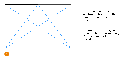
We now have an area, shown in red, in which to construct the grid.
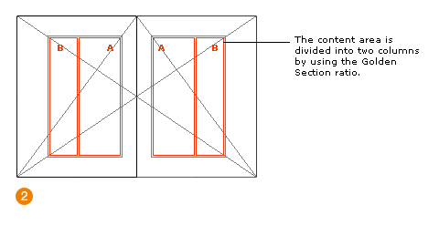
Applying the Golden Section
Now you’ve read the other articles you will see that applying the ratio to this area is pretty straight forward. The area is divided using Phi which gives us two columns, A and B.
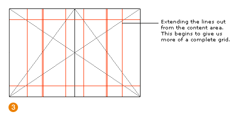
Creating the system
So, we’ve got the columns, we now need to flesh out the grid to be able to cope with the different content and page types. First off, we extend the lines of the content area and the columns.
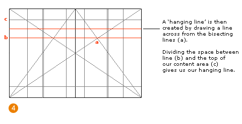
We then apply a horizontal rule cutting across content area creation lines. I call these ‘hanging lines’, not too sure what the correct terminology is. But anyway, the content ‘hangs’ from these lines giving us consistency throughout the book. It gives the reader a line, in the same place, to rest their eyes on page after page.
Using the extended lines we can then add areas for the access structure of the book—folios etc. These typically sit outside of the content area, usually with plenty of white space around them, as to show that they are different ‘types’ of content.
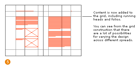
We can then add various designs to this grid comfortable in knowing that the individual elements of the design—text, images, access structure elements—will all have a relationship to each other and to the book size.
Relating to grid systems
Creating grid systems in this way—using ratios to create related lines on which to construct composition—ensures a balanced grid.
I’m afraid it isn’t an exact science though. A lot of grid design is experimentation with ratios, it’s experimentation with using white space and elements of content such as photographs and text. It’s also about conventions. Don’t reinvent the wheel needlessly, study the conventions used in magazines from all sectors—from architecture to nursing (seriously, some magazines from unexpected professional sectors have fantastic grid designs).
What I’m saying is, have a play with grid design. Just because I’m talking about ratios, subdivisions and modularisation, doesn’t mean designing grids should be dull. Have a mind on the end product, but not at the expense of the process of designing your grid.
The series
This is the second installment of this “Simple Steps…” series.
- Subdividing ratios
- Ratios and complex grid systems
- Grid systems for web design: Part 1
- Grid systems for web design: Part 2 Fixed
- Grid systems for web design: Part 3 Fluid
Tags that this post has been filed under.