Five simple steps to designing grid systems - Part 4
Layout seems to be a hot topic at the moment, mostly prompted by the ALA redesign and the numerous discussions of the choice by Jason and the ALA team to go 1024 for a fixed width. I’m not going to go into my thoughts on ALA in too much depth here, there’s been a lot of that already, but it seems like the right time to get this article out.
So, fixed width grid design for the web. What is it, how do we do it and how do we implement it?
For the purposes of this article, I’m going to be focussing on the theory of creating the grid rather than the implementation. I did mention in the last series that I would cover implementation using CSS, well I’m not going to. There are just so many resources and books available telling you how to create the CSS layouts you need—I’ll touch on it, but I won’t be going into too much detail.
The Measurements
A fixed grid for designing for the web is as close a translation from traditional grid design as there is. The designer is using fixed measurements, pixels mostly, to construct the grid and to position elements within the grid structure and a canvas which is based on a fixed size. See, everything is fixed.
The Canvas
Now things start to get a little less concrete. The canvas size for print design is determined by the media size - paper, signage, envelope, whatever. The canvas size for fixed grid design on the web is normally determined by the browser window size, which is in turn determined by the user’s screen resolution. These are not fixed. Therefore a designer should design to the minimum requirement, which is normally the average screen resolution for the majority of users.
I’m not going to quote figures here, because I’ll probably be wrong, but I don’t think I’m wrong in saying that 800x600 pixel screen resolution has, for quite a few years now, been the screen resolution to design to.
As I mentioned, with the relaunch of ALA, and sites like Stylegala, there has been a renewed discussion about fixed width grids for 1024. So, what’s my opinion on this? Well, in terms of the actual grid design it really doesn’t matter what size the canvas is. What should be determining the decision to go 1024 is research into user’s screen resolutions. If the user base of a certain site is shown to be using resolutions of that size and above, then a decision to use that size to design to is a valid one.
However, as some people have noted, even if you do run at a higher resolution than 800x600 does that mean your browser window occupies the entire screen? The answer to this is, generally we don’t know. I personally think that not only is it platform specific, but it’s also down to the individual and their experience level. Maybe more experienced users on a PC don’t use their browser’s at full screen. From my experience running user tests with a wide range of people, is that more novice users, particularly on a PC, run a browser at full screen because that is the default, whereas on a Mac the default isn’t full screen.
What I haven’t touched on yet is the device you are using. This of course could be a PDA, a mobile phone or a computer. Grid designs should be looked at for each of these devices.
That is all I’m going to say on the matter for now though. Once the final part in this series is up, fluid grid design, there can be a more informed discussion I think.
Nice, easy dimensions and thinking modular
Without further a do, let’s get into this grid design.
As discussed in the rest of this series (part 1, 2 and 3), we will begin our grid design by 'shaping the page.
For the purposes of this simple (I am trying to keep it simple) article, I’ll be using 800 x 600 as my default resolution to design to. For many years I’ve designed to a base minimum (based on 800 x 600) of 760px x 410px (410px being the fold). Don’t ask me where I got these figures from, but it just stuck and seems to be ok for most platforms and browsers. Oh, you can of course go smaller than this and don’t pay too much attention to the fold, in my experience most users don’t have a problem with scrolling.
We begin by applying ratios to this canvas, in the same way we’ve done with designing grid system for print. The example I’m using for this tutorial is my own site, which uses a fixed grid and sits happily below 760px wide.
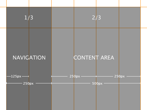
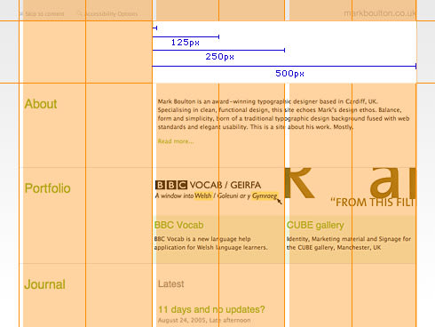
The design for my site is built around around a very simple grid system. Once I had my grid, I used photoshop to comp together the designs positioning any elements exactly on the grid lines. The grid was designed intially for a content and navigation area based on the Rule of Thirds (which is roughly approximated around the Golden Section), the dimensions of which are 250px and 500px respectively. The content area is then subdivided into two 250px columns.
See, nice easy dimensions. However, this only deals with horizontal measurement. As discussed in the other grid articles, vertical measurement is also important, but this is where we can run into problems with designing even fixed grid systems on the web.
When user’s change the type size, elements move vertically (if we’ve fixed the horizontal widths). The vertical measurements that we’ve crafted suddenly disappear. Now, in the purist’s eye, this is a real problem but it is something we have to design to. We really can’t do anything about it when designing with fixed units such as pixels which can’t be resized by the user.
Just a word about Gutters
Gutters are the gaps in between columns. They are there so text, or image, from different columns don’t run into each other. In grid system design sometimes, depending on what theory you read, gutters are seperate to the columns. This creates practical problems for us when designing grid systems on the web because of the way we create the columns.
Generally the columns we create, using Web Standards, are ‘divs’ which are given widths and positioned and styled using CSS. So, ideally, if we’re creating these columns, we don’t want to be creating seperate ones for the gutters. We therefore deal with gutters as part of columns and they are implemented using padding, or creating margins, on elements positioned within them, or sometimes the column divs themselves.
Creating the design
The thing about designing to grids is that in order for the grid to work you must consistently align items on the grid lines. I know that sounds totally obvious but designing to strong grids means you have to take a step back from what you think the design should look like (and then adding things to the grid to suit), and instead concentrate on creating a harmonious design within the framework you’ve created.
The bulk of the design work, if you exclude sketching with a pencil, is done in Photoshop. First of all I take great care in drawing the grid accurately, to the pixel, and then I overlay content elements ensuring the alignment is precise.
From Photoshop to the browser
As I stated at the beginning of this article, I’m not going to concentrate too much on how you actually build a multi-column CSS layout, there are just so many other great resources on that topic.
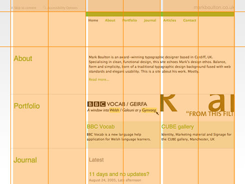
One of the most useful ‘tools’ for creating pixel-perfect grid systems for the web is Khoi’s superb idea of using a grid as a background-image element on the body tag. To summarise: Using the grid I designed in photoshop, I save it out as a gif and then apply that to the background of the body tag. This provides me, throughout the build of the site, the grid so I can align all the content elements accordingly.
As you can see from the diagram, this makes production of the design incredibly easy when you have a visual reference rather than having to remember your grid or interpret a sketch.
Implementation using Web Standards
This really could be a series all on it’s own. Implementation of a multi-column grid using CSS is pretty standard practice nowadays, but there are some very useful resources out there which I have used for the past 18 months or so.
Doug Bowman at Stopdesign has pioneered a technique for producing flexible column layouts using CSS and controlling them by giving a class to the body tag. This is the techique I’ve used throughout this site. This means if I create a new section of the site or simply decide one day that I’d rather have my navigation on the right, all I have to do is change the class on the body element and everything switches over. Using this technique, along with Khoi’s technique for sense checking the design against the grid, has been an excellent way to produce tight, grid layouts for me, give it a go and let me know what you think.
Up next: Fluid grid systems for the web.
Timely? Yes. Complicated? Yes, but they don’t have to be. Fluid, or flexible, grid systems have a rightful place in grid system design for the web but they come with their own particular set of challenges. In the next installment I’ll be having a look at flexible grids using relational measurements and also tying the grid design closer to the typography rather than the browser - flexible from a type perspective, rather than a browser perspective. Stay tuned.
The series
This is the fourth installment of this “Simple Steps…” series.
- Subdividing ratios
- Ratios and complex grid systems
- Grid systems for web design: Part 1
- Grid systems for web design: Part 2 Fixed
- Grid systems for web design: Part 3 Fluid
Tags that this post has been filed under.