Five simple steps to better typography - Part 3
 I’m pleased this series is turning out to be so popular and it’s somewhat confirmed what I suspected. A bit of a thirst for simple typographic design theory.
As I’ve been writing this series i’ve deluged by email and comments from people agreeing, disagreeing, asking for more information etc. What’s great is designers are thinking and talking about typography again. Designers are questioning typography and not just letting the font and the software do the work. It’s nice to hear. But enough back-slapping Mark, on with the next in the series…
The third installment of this series is dedicated to just one typographic element - Ligatures.
Ligatures are combinations of letters - some of them are functional, some are decorative. They are more commonly seen in serif faces, although ligatures in sans-serif faces such as Gill Sans and Scala Sans are important to the typeface and should be used.
They are generally comprised of certain characters which are created to stop collision of elements of letterforms. Take the letter f of a serif typeface. In lower case, especially italic, the top and tail of the f move into the character space next to it. These overlaps are what typographers call kerns.

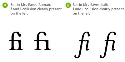
It’s when these overlaps collide with letters next to them that we have problems. Take lower case f and lower case i, probably the most widely used ligature. When set in Roman (A, above), the ascender of the f collides with the dot of the i, the effect is much worse when set in italic (B, above). Type designers therefore combined the character into the fi ligature. As you can see, the dot from the i is simply removed.

Ligatures and language have been closely tied throughout typographic history. Typographers in the sixteenth century devised ligatures to cope with common occurrances of letters in latin - fi, ffi, fl, ffl, ff (shown above). You will find at least a couple of these in most fonts. But, as langage has changed to encorporate different words, especially english, the need for more obscure ligatures has grown.
Take the word fjord for example. The ascender of the f will collide with the dot of the lower case j. This is resolved the same way as the fi ligature in that the dot is removed from the j. The trouble with less common ligatures like this is that they generally aren’t in the standard character set of a font, so we kind of have to make do or if setting type in a program like Adobe Illustrator, make them by hand. And this brings me neatly onto practical usage of ligatures.
Usage in print
I tend to use ligatures specifically for headlines. Occasionally, if the job demands it, I will use ligatures for body copy as well but this does tend to make typesetting a little time consuming.
If for example I’m creating a logotype for a coffee shop called “Flow’s fine beans” (a convenient amount of ligatures present there!). The name could simply be set in a font which does not require ligatures, but this could make the logotype quite plain. The font chosen could be serif, but special care must be given to the kerning and overall appearance when setting logotypes that use ligatures.

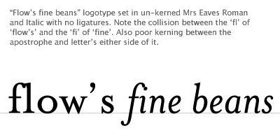
This logotype, shown above, is simply typed using Mrs Eaves. See how the ligatures appear too close to each other creating dense areas of type. The gaps between certain letterforms are also unsettling to the eye. This needs to be manually kerned.

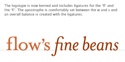
If the type is set carefully the ligatures add typographic interest to the words. They add character and begin to tell a story about Flow’s shop - it’s a classy place, nice coffee too!
So, careful attention to detail at this stage can help define a logotype and go a long way to help define brand message - all through the simple use of ligatures.
But what about on the web?
Usage on the web
Ligature usage on the web is a bit tricky. Functionally there are special characters for the following ligatures - these are needed for linguistic reasons.
Æ
Æ
Capital AE
æ
æ
Lower-case ae
Œ
Œ
Capital OE
œ
œ
Lower-case oe
Ð
Ð
Icelandic upper-case eth
ð
ð
Icelandic lower-case eth
ß
ß
German double-s
Þ
Þ
Icelandic upper-case thorn
þ
þ
Icelandic lower-case thorn
They should be present in body copy and headline copy for those languages that require them. What HTML doesn’t cater for is the use of the five main ligatures - fi, ffi, fl, ffl, ff within the special character codes. The fonts generally do have these ligatures present but it’s debatable whether they needed to be used on screen or not.
I tend to only use ligatures for on screen use if I’m creating logotypes, or graphical headers or elements that require them. In this instance all use of ligatures is fine. There are many people who disagree, stating that ligatures are a relic of by-gone age. I disagree. The use of ligatures in your typesetting, for print or on screen, shows a typographic maturity and an understanding of the craft.
The series
This is the third installment of this “Simple Steps…” series. Next up we have Typographic Hierarchy
Tags that this post has been filed under.