A New Make Mantra: A Statement of Design Intent
When I first worked in a design studio, I was taught that the first thing to do, as part of the project discovery, was to ‘interrogate the brief’, or ‘rewrite the brief’. This normally involved getting a brief from a client, for us to ask questions, conduct research and then write our own brief and deliver it back to the client to demonstrate our understanding of the project and what we’ve learnt about their business. It’s important to note, this isn’t a proposal. This brief did not include the how, it was the what. What is the project.
At some point in my career, I stopped doing that. I still spent time trying to understand audiences and business, but the ‘creative brief’, as we called it, was something that wasn’t produced. Instead, we normally had a plan. This would exist as documents, or conversations, or outcomes from workshops. The point is, they were many things - all collectively known as ‘The Strategy’.
Recently, I’ve been trying to go back to something a bit more formal and create a single, actionable sentence that can be used to guide a project. This started out as a selfish endevour: I had trouble keeping all of this project stuff in my head in a way that could help my design work. It needed to be simpler.
A Make Mantra
Guy Kawasaki wrote about something similar in 2006, calling them a ‘Make Mantra’.
A mantra is three or four words long. Tops. Its purpose is to help employees truly understand why the organization exists.
The examples he cites, if he had his way to create some, were:
- Federal Express: “Peace of mind”
- Nike: “Authentic athletic performance”
- Target: “Democratize design”
- Mary Kay “Enriching women’s lives”
So, in 2006, they could be used by organisations to describe themselves. However, what I wanted to do was something different. The statement I was after was not a description of what an organisation does, or the story it’s telling its customers, or how it talks about itself, but rather a description of what we must do on the project. A Statement of Design Intent. A new Make Mantra for the Maker, not for the organisation.
Why do this?
- It’s a guide. When you meander on a project, it can help bring you right on track
- It’s a springboard for ideas.
- It helps frame an otherwise complex strategy into an easily digestible statement that creates pictures in your head.
- They help communicate change. In big organisations, and big projects, change is painful.
These statements of intent are a tool. Used to communicate, guide, as a springboard for ideas. A central theme on which to build. They’re a star to sail your ship by.
Putting it into practice
Since last year, Mark Boulton Design has been working with CERN in Geneva redesigning the public website and creating a design language to be used throughout all their other websites.
Redesigning the CERN website is a complex project. It involves a lot of discussion, research and laying the foundation to ensure we can do our best work. A key part of that work for me was to distill our design strategy into something I could use daily. So how did we do that?
How?
The important thing about these mantras is they are tools that you should use every day, not just some strategy artefact, to be created, delivered, agreed and then forgotten. How did we use it in practice?
- Research. For CERN, we ran spent a few months talking to people: internal stakeholders, and visitors to the main public website. We gathered a lot of data and then we spent weeks doing the analysis. Really distilling the data to try and define who the audience was and what they want.
- Competitor Analysis. Find out who is doing something similar. How does that apply to your project?
- Understanding the problem. Through the research, we spent a long time learning about CERN, learning about the problems with the existing site and editorial workflows.
- Create a clear strategy and goals. What are you trying to achieve and how you’re going to do it. My experience is this always changes following the research.
- Boil, simmer, reduce. Through a number of workshops and discussions, we reduced the strategy into a single statement of design intent.
Through our research, we know that people are curious, inspired and intrigued by what goes on at CERN. But the content they read on the CERN site does not – in a large part – delivers on the ‘can this user accomplish this task’ success criteria.
We also knew that the different audience groups we identified for the project need to be spoken to in very different ways: the general public needs to be spoken to very differently to high energy physicists.
Through our competitor analysis, we identified NASA as doing similar work on a human scale: the exploration of science. But, you see, it’s really easy for NASA to inspire people visually because they have pictures of space rockets and planets. CERN had pictures of magnets the size of a house and lots of wiring. Cool, but only to a certain amount of people. We needed to show that what NASA is doing with outer space, CERN is doing for inner space. We needed to Create Wonder. To inspire, to inform, to tell the right story. So, that became our simple, two word statement:
‘Create Wonder’.
We use this simple statement in the project every day this way:
- To check that we’re on track with the design language. Even as simple as something like a photograph. Is is doing this?
- To talk about our design strategy in CERN to stakeholders. Not just initially, but as we design new elements of the site too.
- To create pictures in our heads. It is a challenge to us when we’re approaching the work: ‘go on… create wonder’.
- As a scale: The Wonder Scale.
The Wonder Scale
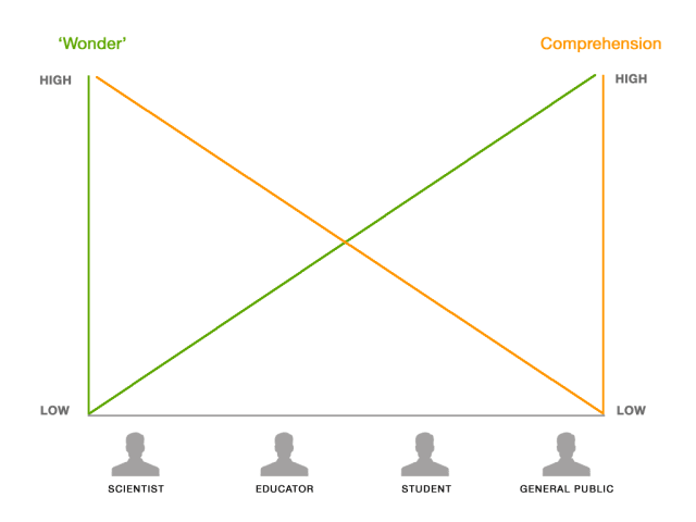
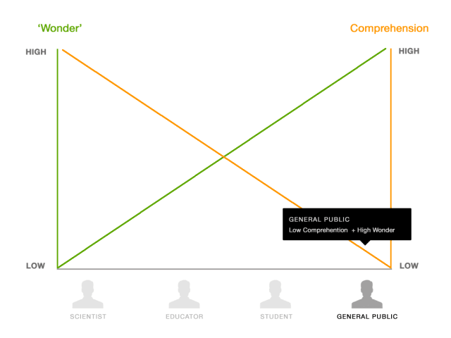
The strategy very quickly morphed into a scale we could apply to different audience groups. The issue was that presenting some content in a wondrous design would not be appropriate for some audiences. For example, the latest research that’s been published by one of the experiments at CERN should not necessarily be highly visual. The content should be clear, legible, easily scannable etc. But it shouldn’t be shiny. And the opposite is true for other content that is designed to inform, inspire and educate the general public. In that case, the wonder is ‘high’, the former, it is ‘low’.
Let’s have a close look at this.

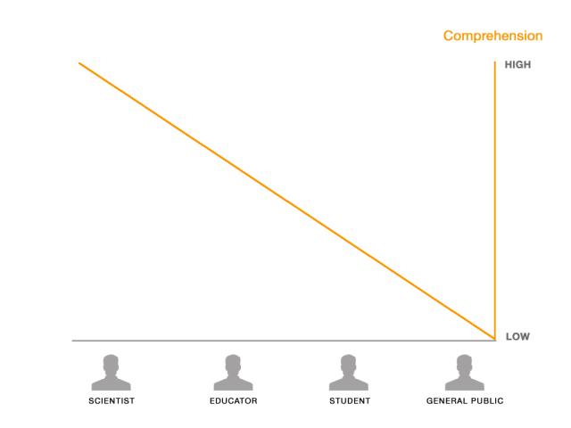
On this diagram, you can see our four audience groups: Scientists, Educators, Students and General Public. We created personas for each of these, and each of them had a comprehension level: how much they understood about the work CERN does. This went from high for scientists, to low for the general public.

We can then map an inverse ‘Wonder Scale’ on this. The more comprehension you have, or closer you are to the science or organisation, then the lower the Wonder.

So, we had this scale based on our statement of design intent. How did we actually use it in the design work?
How does it look?
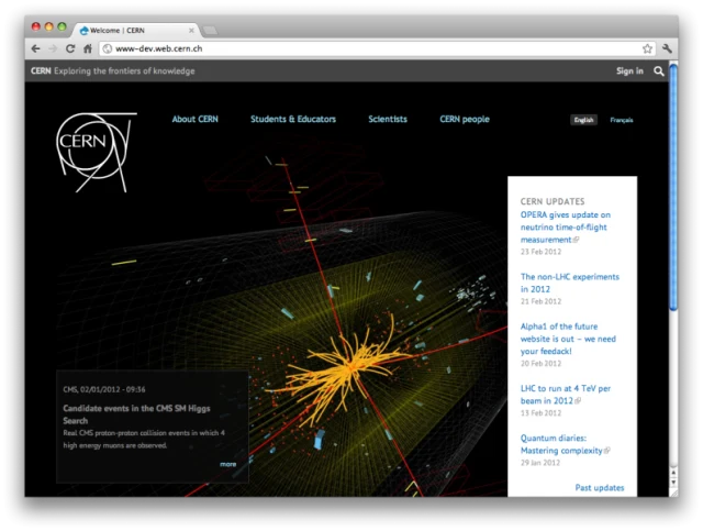
This is a screenshot of our latest prototype for the homepage of CERN. Let me walk through what we’re trying to do.

The Goals.
- Create Wonder. The CERN homepage needed to show what CERN was doing as well as say what it was doing.
- The main thing that came through time and time again from the research we conducted was that all the different audience groups need updates. They need to know what’s going on. That was probably the largest need.
- Demonstrate that there are more experiments going on at CERN than just the Large Hadron Collider.
- Effectively funnel people into sections of the site that are appropriate for them.
The How
-
Create Wonder. Because the work going on at CERN is subatomic, it’s very difficult to get imagery that is remotely interesting. You can’t photograph these particles, and as such, the default option is to rely on imagery of the engineering. The engineering at CERN is unique, and awesome, but you’d need to know what you were looking at to appreciate it. The level of comprehension required is high. What we settled on was Event Visualisations.
Every 600 million times a second, protons are smashed together at near the speed of light at various points in experiments in CERN. The computer than creates an image of this. Part of our strategy for the homepage (and how we ‘Create Wonder’) was to show what was happening at CERN right now. Demonstrate these collisions were happening in real time.
-
All about the updates. We make the updates panel the primary content on the homepage. It’s updated with links to articles, research, press releases, but also includes statements such as ‘LHC shutdown for Holidays’.
-
A lot of people think CERN is just the LHC, but the LHC provides the beam of protons and there are many, many experiments that use it. The small panel on the bottom right will rotate through a status update of a selection of experiments.
Throughout this process, ‘Create Wonder’ was an invaluable tool to sense check our progress. Are we on the right track? Is this content appropriate for this audience, and how should it be presented? Are the stakeholders on board with this strategy?
A New Make Mantra
Now, this is an example from a big, complex project, but you can use these for small projects, too. It’s just the time you take to get to it might be shorter. I’d highly recommend giving them a try: stick them up next to your desk, refer to them constantly, use them as a metric to define how you talk to potentially different audiences for your designs.
I’m excited to use these in my work more. They move a Make Mantra from being about the organisation to a tool for designers to use. Moving it from the organisation to the Maker.
Tags that this post has been filed under.